Two Inks for the Fall — Pilot Momiji and Murasaki Shikibu

I love fall. Don’t we all? It’s a time for apples and mooncakes, wagashi and tea, Halloween and pumpkin pies. It’s a time for deep thoughts and reflection, and last but not least, academia. It’s back-to-school season, so that also means it’s time to think about stationery.
For me, there are few things more fall than plopping down at a wooden table, pouring hot tea into my cup, taking a bite of some delicious, meticulously chosen dessert (daifuku, anyone?) and letting the mix of flavors seep into my tongue. As I pick up my notebook, smoothly sliding my fingertips and palms across its softcover and then the blank pages inside, the tactile feedback creates a quiet anticipation within me. My ears await the satisfying ‘pop’ from uncapping one of my favorite pens, and then there’s that final, glorious moment when nib meets paper...
But wait, there’s one crucial piece of this sensual puzzle that’s been left out — the ink! No matter how smoothly your pen writes, no matter how beautiful your notebook is, without ink, you’re a fish out of water.
I’ve been in this exact situation countless times. I’ve built up all that tension and anticipation, only to realize I am...inkless.
Fortunately, it is because of those inkless tragedies that I’ve uncovered a hidden truth: Putting pen to paper gives a calm, zen-like satisfaction, but the INK is it what really puts the smile on my face. The ink is the sea that I long for. The ink is really the key to this whole experience.
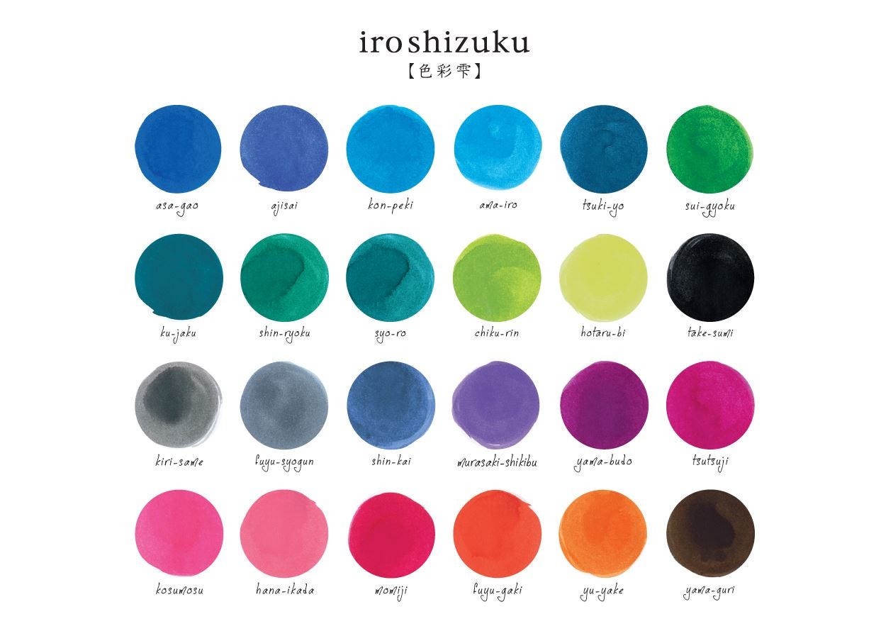
It’s difficult to articulate why, but there’s something mysterious, authentic, and captivating about ink that touches the soul directly, much like looking into someone’s eyes. I think this holds true for Pilot’s Iroshizuku inks as well. So I wanted to share my recent experiences with two of these precious inks, ‘Momiji’ and ‘Murasaki-Shikibu’ specifically.
First and foremost, I’ll just flat out say it, I love these inks and what they are intended to represent. Paraphrasing Pilot’s words a bit, the Iroshizuku inks ‘contain all the poetry of the landscapes of Japan’. As a more than casual admirer of classical Japanese literature, this description speaks to me. Pilot, I see you.
That said, please don’t take my experience as some sort of objective standard. Some things are just a matter of personal taste, you know?
A second point I want to make is that I chose these inks specifically because I wanted something connected to the seasons, but which season in particular? You guessed it, folks — fall. But what do these colors have to do with fall?
In Japan, red maple leaves (Momiji/もみじ) point to warmth, impermanence, and fleeting beauty, while in the West, red signals vitality, passion, and the richness of the harvest!
And then we have Murasaki Shikibu (the plant, not the author), which evokes the introspection and elegance of Japan’s Heian era. And in Western tradition, purple represents royalty, wealth, dignity, luxury, as well as mystery and magic.
So, in other words, these inks are about as fall as fall can get.
Now, with that out of the way, let’s get to the review. I’ll be using two of my Hongdian (弘典) C2 pens and a Leuchtturm 1917. Also, as a celebration of fall, I’ll be using my perfectly objective (I’m joking) ‘Black tea’ scoring system. 5/5 cups is a perfect score. 0/5 is plain, hot water :)
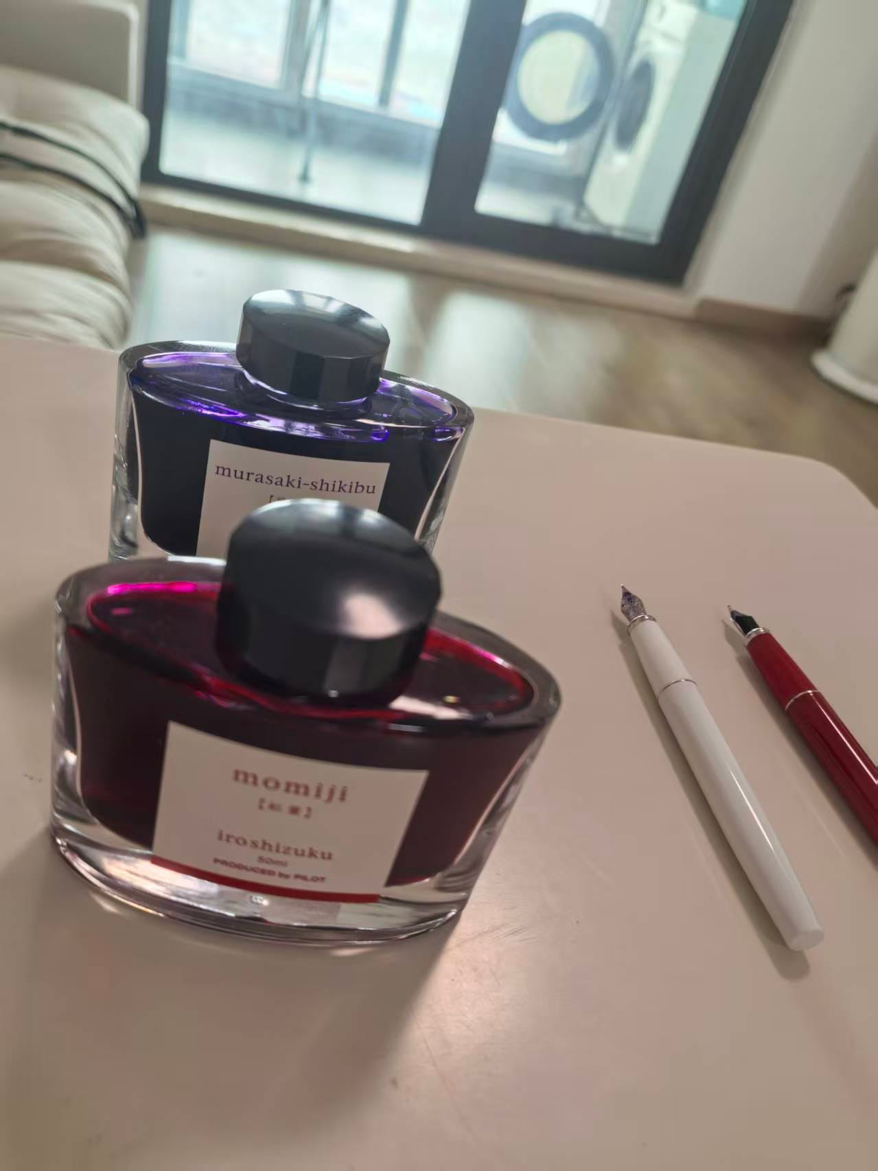
First up — Momiji 🍁
If Cupid had his own ink, it would be this one. It’s warm and luscious like lipstick or a Valentine’s Day rose, but with just enough pink to keep it lively. Out of my C2, it flows smoothly and obediently, never too wet or dry, and on the page, it dries fairly quickly — good enough for me to easily avoid smudging. But what truly makes Momiji special is the energy it radiates: it’s still joyful, crisp, and wistful, like the autumn air.
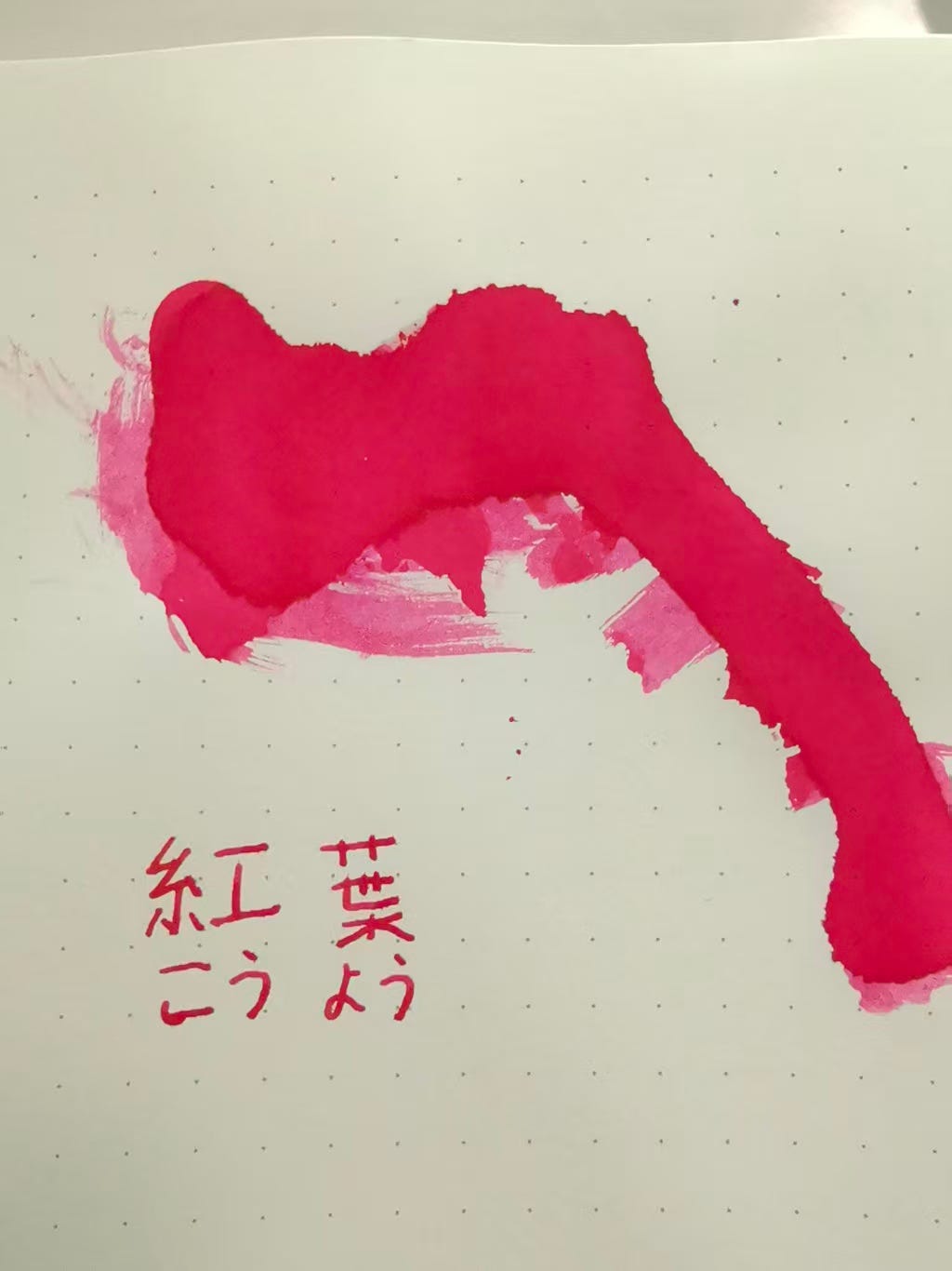
Score: ☕☕☕
3 cups of Black Tea (out of 5). It’s not bad! I kind of wish it were yellower/more fiery, though, to be honest.
💜 Murasaki Shikibu

If Momiji is a walk through red leaves, Murasaki Shikibu is the quiet study afterward. The color sits gracefully between violet and royal purple — rich but not ostentatious — and under bright light, you can catch soft shading that hints at ink’s literary namesake. It flows a touch wetter than Momiji, lending it an elegant smoothness that makes you slow down without realizing it. There’s an introspective calm in writing with this ink, like the hush that follows reading a good poem. It’s the perfect companion for journaling, letters, or even poem writing.
Rating: ☕☕☕☕
4 cups of Black Tea (out of 5). More my style 😎, but to each their own!
Ink is more than just color — it’s a mood, a ritual, a landscape, and a decision. If you choose the warmth of Momiji or the cool elegance of Murasaki Shikibu, you will sense the essence of autumn: the balance between movement and stillness, passion and thought. Here’s to fall, to good tea, and to the simple joy of putting pen to paper — one sip, one word, one page at a time. Enjoy the season, everyone ~
🍁 BDJS